Branding
FIGANT – Brand Identity
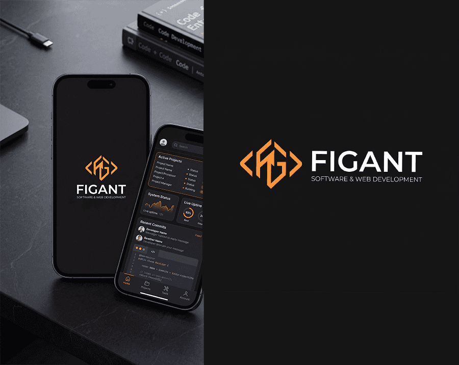
A modern brand identity for a software and web development company, focused on combining typography, geometry, and code-inspired elements into a clean and scalable visual system.
Industry :
Technology / Software Development
Client :
Figant
Project Duration :
1 weeks

Overview:
FIGANT is a conceptual brand identity project created for a modern software and web development company. The goal was to design a clean, scalable, and tech-driven visual identity inspired by code, structure, and precision.

Challenge :
The challenge was to create a logo that feels both technical and modern, while remaining simple, memorable, and scalable across digital platforms.
The identity needed to:
Reflect software development and coding culture
Work across multiple touchpoints (web, app, icon)
Maintain clarity even at small sizes

Concept:
The concept is built around the idea of merging typography with code-inspired elements.
Key directions:
Use the letters F and G as the foundation
Introduce subtle references to coding symbols like
< >Create a geometric structure that reflects logic and systems
Design Process :
Phase 1: Typography
The process began with exploring modern sans-serif typefaces to establish a strong and clean typographic base.
Phase 2: Element Focus
Key characters — specifically F and G — were isolated and analyzed to find opportunities for visual transformation.
Phase 3: Geometric Abstraction
The letterforms were simplified into geometric shapes and aligned within a structured grid system to ensure balance and consistency.
Phase 4: Symbol Construction
The final symbol was created by combining the abstracted F and G with subtle coding references, forming a unified and distinctive mark.
Final Identity
The result is a minimal yet expressive logo that captures the essence of a modern tech brand.
Clean and scalable
Recognizable at small sizes
Strong connection to coding and development
Visual Language
The visual identity uses a dark foundation with orange accents, creating a balance between:
⚫ Stability and professionalism
🟠 Energy and creativity
This combination reinforces the brand’s position as both reliable and innovative.
Application
Digital Environment
The logo is designed primarily for digital use and integrates seamlessly into:
Websites
SaaS dashboards
Mobile applications
Scalability
The symbol works effectively as:
App icon
Favicon
UI element
Conclusion
FIGANT demonstrates how a brand identity can be built from simple typographic foundations, transformed through geometry, and elevated with conceptual thinking.
The result is a cohesive and modern identity tailored for the digital space.

More Projects


Branding
FIGANT – Brand Identity
A modern brand identity for a software and web development company, focused on combining typography, geometry, and code-inspired elements into a clean and scalable visual system.
Industry :
Technology / Software Development
Client :
Figant
Project Duration :
1 weeks
Overview:
FIGANT is a conceptual brand identity project created for a modern software and web development company. The goal was to design a clean, scalable, and tech-driven visual identity inspired by code, structure, and precision.
Challenge :
The challenge was to create a logo that feels both technical and modern, while remaining simple, memorable, and scalable across digital platforms.
The identity needed to:
Reflect software development and coding culture
Work across multiple touchpoints (web, app, icon)
Maintain clarity even at small sizes
Concept:
The concept is built around the idea of merging typography with code-inspired elements.
Key directions:
Use the letters F and G as the foundation
Introduce subtle references to coding symbols like
< >Create a geometric structure that reflects logic and systems
Design Process :
Phase 1: Typography
The process began with exploring modern sans-serif typefaces to establish a strong and clean typographic base.
Phase 2: Element Focus
Key characters — specifically F and G — were isolated and analyzed to find opportunities for visual transformation.
Phase 3: Geometric Abstraction
The letterforms were simplified into geometric shapes and aligned within a structured grid system to ensure balance and consistency.
Phase 4: Symbol Construction
The final symbol was created by combining the abstracted F and G with subtle coding references, forming a unified and distinctive mark.
Final Identity
The result is a minimal yet expressive logo that captures the essence of a modern tech brand.
Clean and scalable
Recognizable at small sizes
Strong connection to coding and development
Visual Language
The visual identity uses a dark foundation with orange accents, creating a balance between:
⚫ Stability and professionalism
🟠 Energy and creativity
This combination reinforces the brand’s position as both reliable and innovative.
Application
Digital Environment
The logo is designed primarily for digital use and integrates seamlessly into:
Websites
SaaS dashboards
Mobile applications
Scalability
The symbol works effectively as:
App icon
Favicon
UI element
Conclusion
FIGANT demonstrates how a brand identity can be built from simple typographic foundations, transformed through geometry, and elevated with conceptual thinking.
The result is a cohesive and modern identity tailored for the digital space.
More Projects
Branding
FIGANT – Brand Identity
A modern brand identity for a software and web development company, focused on combining typography, geometry, and code-inspired elements into a clean and scalable visual system.
Industry :
Technology / Software Development
Client :
Figant
Project Duration :
1 weeks
Overview:
FIGANT is a conceptual brand identity project created for a modern software and web development company. The goal was to design a clean, scalable, and tech-driven visual identity inspired by code, structure, and precision.
Challenge :
The challenge was to create a logo that feels both technical and modern, while remaining simple, memorable, and scalable across digital platforms.
The identity needed to:
Reflect software development and coding culture
Work across multiple touchpoints (web, app, icon)
Maintain clarity even at small sizes
Concept:
The concept is built around the idea of merging typography with code-inspired elements.
Key directions:
Use the letters F and G as the foundation
Introduce subtle references to coding symbols like
< >Create a geometric structure that reflects logic and systems
Design Process :
Phase 1: Typography
The process began with exploring modern sans-serif typefaces to establish a strong and clean typographic base.
Phase 2: Element Focus
Key characters — specifically F and G — were isolated and analyzed to find opportunities for visual transformation.
Phase 3: Geometric Abstraction
The letterforms were simplified into geometric shapes and aligned within a structured grid system to ensure balance and consistency.
Phase 4: Symbol Construction
The final symbol was created by combining the abstracted F and G with subtle coding references, forming a unified and distinctive mark.
Final Identity
The result is a minimal yet expressive logo that captures the essence of a modern tech brand.
Clean and scalable
Recognizable at small sizes
Strong connection to coding and development
Visual Language
The visual identity uses a dark foundation with orange accents, creating a balance between:
⚫ Stability and professionalism
🟠 Energy and creativity
This combination reinforces the brand’s position as both reliable and innovative.
Application
Digital Environment
The logo is designed primarily for digital use and integrates seamlessly into:
Websites
SaaS dashboards
Mobile applications
Scalability
The symbol works effectively as:
App icon
Favicon
UI element
Conclusion
FIGANT demonstrates how a brand identity can be built from simple typographic foundations, transformed through geometry, and elevated with conceptual thinking.
The result is a cohesive and modern identity tailored for the digital space.