Web Design
RUNA – Natural Energy Drink Branding & Packaging
A concept project exploring the design and positioning of a natural, caffeine-free energy drink targeted towards a health-conscious audience.
Year :
2024
Industry :
FMCG
Client :
Kombucheriet AB
Project Duration :
2 weeks

OVERVIEW :
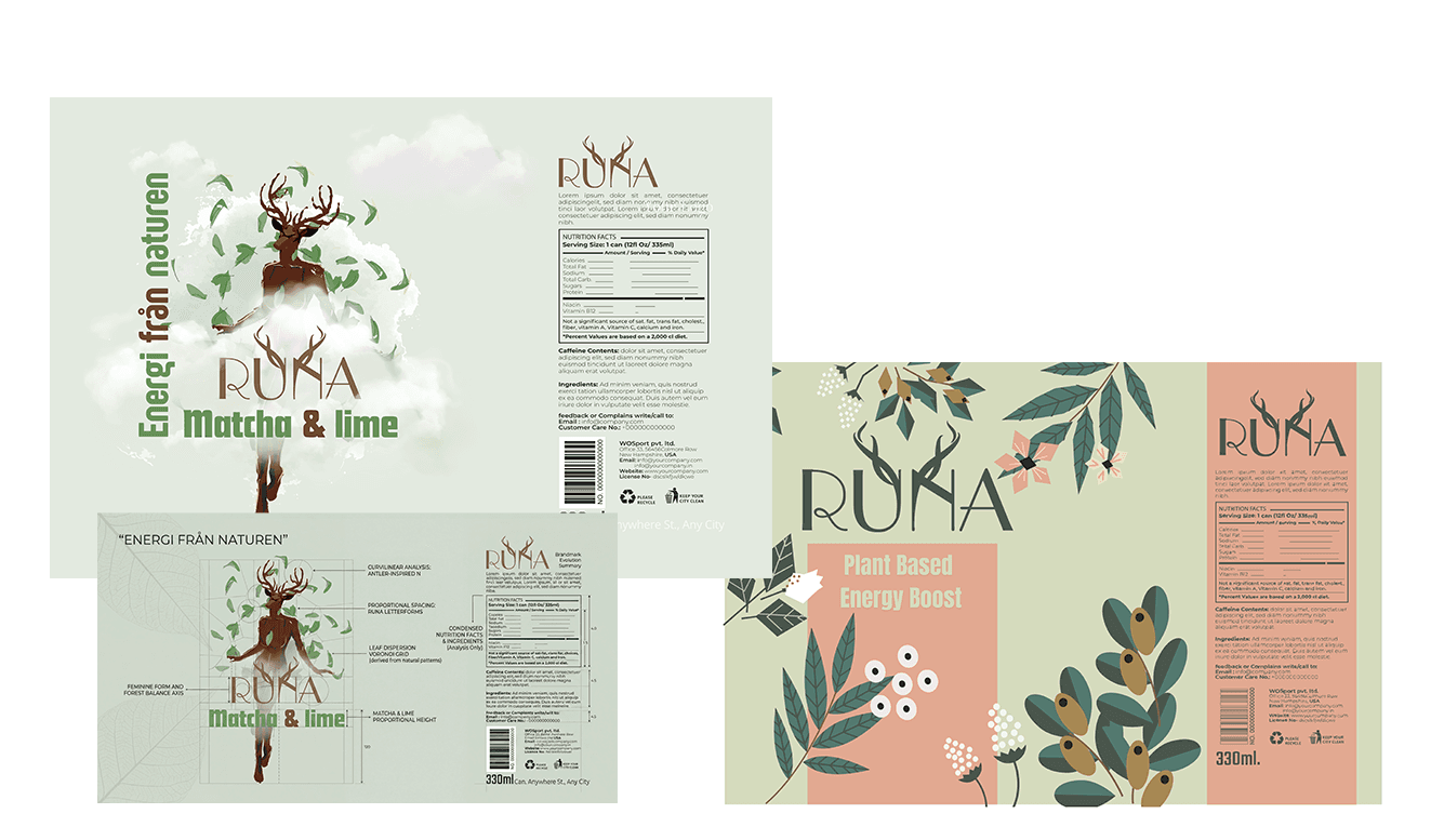
RUNA is a concept for a plant-based, caffeine-free energy drink,developed during my internship at Kombucheriet in Stockholm. The project focused on creating a unique visual identity that appeals to a younger audience while communicating a natural and healthier alternative to traditional energy drinks.
The name “RUNA” is inspired by a Nordic goddess, connecting the brand to nature, strength and mysticism.
The visual identity reflects this through organic shapes, earthy color palettes and nature-inspired illustrations.
The goal was to challenge the typical perception of energy drinks, which are often associated with artificial ingredients and aggressive branding. Instead, RUNA was designed as a calm, naturedriven alternative, inspired by Nordic mythology and natural energy sources.

Problem :
The energy drink market is dominated by products with artificial ingredients, high caffeine levels, and aggressive branding that doesn’t appeal to health-conscious consumers.
At the same time, there is a growing demand for natural, low-sugar alternatives and more transparent products.
The challenge was to create a product that feels both energizing and trustworthy, while standing out in a crowded market.


Solution :
I developed RUNA, a plant-based energy drink inspired by nature and Scandinavian mythology.
The brand combines:
Natural ingredients & low sugar positioning
A calm, organic visual identity
A modern but soft design language
The logo is inspired by:
Antlers → symbol of nature & strength
Curved shapes → balance and flow
Minimal typography → modern clarity
The packaging uses:
Earthy green & warm tones
Organic illustrations (leaves, plants)
Clean layout to communicate transparency
Challenge
The main challenge was balancing:
Energy drink = strong, bold
Natural product = calm, soft
Most energy drinks feel aggressive, while natural products can feel too passive.
I solved this by:
Using a strong logo structure
Combining it with soft organic visuals
Keeping the layout clean but expressive
PROCESS & RESULT :
The design process began by exploring how to visually differentiate a caffeine-free energy drink from traditional, high-intensity competitors.
I developed two distinct label concepts, each representing a different interpretation of natural energy—both approved for potential future use.
The final direction balances structure and expression, combining clean, well-organized layouts with organic, nature-inspired visuals to create a calm yet distinctive presence.
The result is a modern brand concept that repositions the energy drink category—shifting the focus from intensity and stimulation to balance, natural energy, and clarity.
This project demonstrates how design can redefine perception and introduce a product into a completely new visual space.
DESIGN THINKING
This project explores how visual identity shapes perception. Instead of following the typical aggressive and synthetic aesthetic of energy drinks, the design introduces a softer, more natural approach creating a product that feels approachable, trustworthy, and aligned with a health-conscious lifestyle.


More Projects


Web Design
RUNA – Natural Energy Drink Branding & Packaging
A concept project exploring the design and positioning of a natural, caffeine-free energy drink targeted towards a health-conscious audience.
Year :
2024
Industry :
FMCG
Client :
Kombucheriet AB
Project Duration :
2 weeks
OVERVIEW :
RUNA is a concept for a plant-based, caffeine-free energy drink,developed during my internship at Kombucheriet in Stockholm. The project focused on creating a unique visual identity that appeals to a younger audience while communicating a natural and healthier alternative to traditional energy drinks.
The name “RUNA” is inspired by a Nordic goddess, connecting the brand to nature, strength and mysticism.
The visual identity reflects this through organic shapes, earthy color palettes and nature-inspired illustrations.
The goal was to challenge the typical perception of energy drinks, which are often associated with artificial ingredients and aggressive branding. Instead, RUNA was designed as a calm, naturedriven alternative, inspired by Nordic mythology and natural energy sources.
Problem :
The energy drink market is dominated by products with artificial ingredients, high caffeine levels, and aggressive branding that doesn’t appeal to health-conscious consumers.
At the same time, there is a growing demand for natural, low-sugar alternatives and more transparent products.
The challenge was to create a product that feels both energizing and trustworthy, while standing out in a crowded market.
Solution :
I developed RUNA, a plant-based energy drink inspired by nature and Scandinavian mythology.
The brand combines:
Natural ingredients & low sugar positioning
A calm, organic visual identity
A modern but soft design language
The logo is inspired by:
Antlers → symbol of nature & strength
Curved shapes → balance and flow
Minimal typography → modern clarity
The packaging uses:
Earthy green & warm tones
Organic illustrations (leaves, plants)
Clean layout to communicate transparency
Challenge
The main challenge was balancing:
Energy drink = strong, bold
Natural product = calm, soft
Most energy drinks feel aggressive, while natural products can feel too passive.
I solved this by:
Using a strong logo structure
Combining it with soft organic visuals
Keeping the layout clean but expressive
PROCESS & RESULT :
The design process began by exploring how to visually differentiate a caffeine-free energy drink from traditional, high-intensity competitors.
I developed two distinct label concepts, each representing a different interpretation of natural energy—both approved for potential future use.
The final direction balances structure and expression, combining clean, well-organized layouts with organic, nature-inspired visuals to create a calm yet distinctive presence.
The result is a modern brand concept that repositions the energy drink category—shifting the focus from intensity and stimulation to balance, natural energy, and clarity.
This project demonstrates how design can redefine perception and introduce a product into a completely new visual space.
DESIGN THINKING
This project explores how visual identity shapes perception. Instead of following the typical aggressive and synthetic aesthetic of energy drinks, the design introduces a softer, more natural approach creating a product that feels approachable, trustworthy, and aligned with a health-conscious lifestyle.
More Projects
Web Design
RUNA – Natural Energy Drink Branding & Packaging
A concept project exploring the design and positioning of a natural, caffeine-free energy drink targeted towards a health-conscious audience.
Year :
2024
Industry :
FMCG
Client :
Kombucheriet AB
Project Duration :
2 weeks
OVERVIEW :
RUNA is a concept for a plant-based, caffeine-free energy drink,developed during my internship at Kombucheriet in Stockholm. The project focused on creating a unique visual identity that appeals to a younger audience while communicating a natural and healthier alternative to traditional energy drinks.
The name “RUNA” is inspired by a Nordic goddess, connecting the brand to nature, strength and mysticism.
The visual identity reflects this through organic shapes, earthy color palettes and nature-inspired illustrations.
The goal was to challenge the typical perception of energy drinks, which are often associated with artificial ingredients and aggressive branding. Instead, RUNA was designed as a calm, naturedriven alternative, inspired by Nordic mythology and natural energy sources.
Problem :
The energy drink market is dominated by products with artificial ingredients, high caffeine levels, and aggressive branding that doesn’t appeal to health-conscious consumers.
At the same time, there is a growing demand for natural, low-sugar alternatives and more transparent products.
The challenge was to create a product that feels both energizing and trustworthy, while standing out in a crowded market.
Solution :
I developed RUNA, a plant-based energy drink inspired by nature and Scandinavian mythology.
The brand combines:
Natural ingredients & low sugar positioning
A calm, organic visual identity
A modern but soft design language
The logo is inspired by:
Antlers → symbol of nature & strength
Curved shapes → balance and flow
Minimal typography → modern clarity
The packaging uses:
Earthy green & warm tones
Organic illustrations (leaves, plants)
Clean layout to communicate transparency
Challenge
The main challenge was balancing:
Energy drink = strong, bold
Natural product = calm, soft
Most energy drinks feel aggressive, while natural products can feel too passive.
I solved this by:
Using a strong logo structure
Combining it with soft organic visuals
Keeping the layout clean but expressive
PROCESS & RESULT :
The design process began by exploring how to visually differentiate a caffeine-free energy drink from traditional, high-intensity competitors.
I developed two distinct label concepts, each representing a different interpretation of natural energy—both approved for potential future use.
The final direction balances structure and expression, combining clean, well-organized layouts with organic, nature-inspired visuals to create a calm yet distinctive presence.
The result is a modern brand concept that repositions the energy drink category—shifting the focus from intensity and stimulation to balance, natural energy, and clarity.
This project demonstrates how design can redefine perception and introduce a product into a completely new visual space.
DESIGN THINKING
This project explores how visual identity shapes perception. Instead of following the typical aggressive and synthetic aesthetic of energy drinks, the design introduces a softer, more natural approach creating a product that feels approachable, trustworthy, and aligned with a health-conscious lifestyle.